CASE STUDY
Kashi Kids Clinic | Identity, sonic thinking and brand system | A volunteering support project
the mandate was simple to make a logo with kashi vishwanath temple. But is designing a logo as simple as putting anything, or resonating with our consumer’s needs and solving for it through trust? And how can that trust be built? In a city like varanasi where everything is quite vaguely launched assuming that a general word of mouth would do the rest, we felt answer lied in creating a positioning system that reduces anxiety, builds trust, and feels intuitively warm. All without diluting medical credibility.
It was about designing for reassurance before treatment.
Children don’t understand medicine. They understand signals: colour, sound, shapes, expressions. Parents don’t just seek treatment; they seek confidence.
The identity was therefore designed as a bridge between emotion and expertise. A space where a child feels safe before the doctor even speaks, and a parent feels assured without over-explanation.
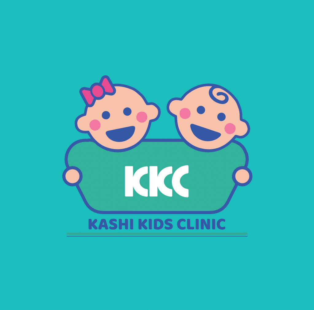
The logo emerges from a simple but deliberate metaphor: forms that resemble protective holding rather than clinical precision. Soft, circular gestures echo the act of care: enclosing, guiding, reassuring.
The visual language avoids sharpness. Instead, it leans into rounded forms and gentle proportions: mirroring the physical and emotional ecosystem of paediatric care.
At its core, the mark behaves less like a symbol and more like a gesture. A quiet cue that says: everything will be fine.
the idea: care that listens before it speaks
Then comes a sonic layer, designed for memory and calm
Beyond the visual, the brand extends into a subtle sonic identity: because for children, sound often registers before sight.
A soft, rhythmic tonal cue which is playful but not distracting. It was conceptualised as an extension of the brand. Think of it as a reassuring presence in waiting areas, digital interfaces, and touchpoints where anxiety tends to peak.
The tonality avoids overstimulation. Instead, it works like a lull: steady, predictable, and calming. A sonic shorthand for safety. Illustrative elements and graphic forms are designed to engage children without overwhelming them: creating moments of curiosity an dhappiness instead of distraction.
What began as a volunteering effort evolved into a foundational system for how Kashi Kids Clinics presents itself to the world. Because in paediatric care, trust isn’t built in consultation rooms alone. It begins much earlier: in the way a space looks, feels, and even sounds.

Leave a comment